
The Product Page That Pays for Itself
She had built something worth buying.
Eighteen months of sourcing. A manufacturer in Surat who finally got the drape right. An Instagram following that was engaged in the way most D2C founders only dream about, people tagging friends, saving posts, asking questions in the comments about whether the kurta runs true to size.
The ads were working. Traffic was consistent. And yet, every Monday morning when she opened her Shopify dashboard, the number that stared back at her was the same: a return rate nudging 28 percent, and a cost per acquisition that refused to come down no matter how well she optimised the campaign.
She called me after reading the last post in this series. The one about retention. She said she had the 90-day flow running, the segmentation logic was in place, Klaviyo was doing its job. But something upstream was broken.
I asked her to pull up her product detail page on her phone.
Three seconds of silence. Then: “Oh.”
The retention engine we built in the last post is only as powerful as the customer velocity feeding it. A 90-day flow cannot save a customer who never converted cleanly in the first place, or one who clicked “buy” with a knot of uncertainty in their chest that later became a return request. If your PDP is converting cold mobile traffic at 1.5 to 2 percent, which is exactly where the industry average sits, your CAC is structurally inflated. Not because your ads are bad. Because the page at the bottom of the funnel is leaking.
The fix is not a redesign. It is a rearchitecting. And the difference matters.
The page your customer actually lands on
Here is what the standard Shopify PDP looks like on a phone. A static image carousel. A product title. A price. A dropdown that says “Select size.” Three paragraphs of description that begin with the words “Made from premium quality fabric.” A button.
That dropdown is where the fashion founder’s business was quietly haemorrhaging.
Sizing confusion is one of the largest single drivers of cart abandonment in apparel, and it is almost entirely a page design problem. The customer does not know which size to pick. The chart is buried in an accordion they have to tap to open. They make a guess. Sometimes they buy. Sometimes they guess wrong and the return lands in your warehouse three weeks later, eating your CM2 from the inside.
The fix here is not a better size chart. It is removing the dropdown entirely and replacing it with an inline configurator that sits directly above the buy button. A few behavioral questions, lightweight and fast: height, preferred fit, what they usually order elsewhere. The logic maps to a variant recommendation and surfaces it instantly. The customer does not guess. They confirm.
This is not a plugin decision. It is a custom-coded interaction that requires thought about how your specific size logic works. But the return rate impact is immediate and measurable, and every point you take off your return rate goes directly back into CM2 without touching your ad spend at all.
The hero section that only shows one person what they need to see
The fashion founder was running three ad campaigns simultaneously. One was targeting women looking for occasion wear. One was targeting everyday workwear. One was retargeting everyone who had visited the site in the last 30 days.
All three of those audiences landed on the exact same product page.
The woman who clicked an ad about workwear kurtis landed on a hero section that was still showing the festive collection shoot from Diwali. The festive buyer who came in through retargeting saw the same layout as a cold visitor who had never heard of the brand. No one was wrong. The page just was not paying attention to who had arrived.
Shopify Metaobjects and URL parameters solve this. When your campaign UTMs are read by your storefront theme, the hero section, the primary value proposition in the headline, even the first lifestyle image can pivot automatically to match the intent of the visitor. The workwear audience sees workwear context. The festive audience sees the world they were already imagining. You are not showing everyone the same door. You are showing each person the door that was already open for them.
Bounce rates drop. Not because you made the page prettier. Because you removed the half-second of cognitive dissonance that was sending people back to the feed.
What a feature description actually costs you
There is a line on the fashion founder’s PDP that read: “Fabric: 100% handloom cotton. Weight: 180 GSM.”
She was proud of that line. She should be. The sourcing behind it was real and deliberate.
But her customer, scrolling on a phone at 11pm, does not know what 180 GSM feels like against her skin. She does not know if it means the kurta will breathe in May or feel heavy by noon. The specification is accurate and completely useless.
What she wants to know is whether it will still look like it did in the photograph after she has washed it twelve times. Whether it will survive the commute without creasing. Whether the drape in the image is achievable in real life or a product of a stylist and two hours of prep.
Replace the specification block with modular, icon-driven units that translate features into outcomes. Not “180 GSM handloom cotton” but “holds its shape through 100 washes.” Not “reinforced stitching” but “built for daily wear, not just the photo.” The goal is to make the post-purchase reality visible before the purchase happens. You are not selling fabric. You are selling the version of themselves they saw in the ad, and the PDP’s job is to close the distance between that image and reality before anxiety fills the gap.
The buy button that moves with them
A content-rich PDP in fashion is long by design. You need the outcome blocks, the configurator, the imagery, the reviews, the care instructions. A customer who is genuinely evaluating the product will scroll.
And somewhere in that scroll, the main “Add to Cart” button disappears off the top of the screen.
Most themes handle this with a floating button that covers content, annoys users, and gets dismissed. The right implementation is a sticky bottom bar that activates precisely when the primary button leaves the viewport, not before. It shows the product thumbnail, the selected variant, the price, and a clean checkout trigger. It does not interrupt the reading. It simply stays available.
On mobile, which is where the majority of fashion D2C traffic lives, this single change lifts checkout initiation rates in a way that is disproportionate to the engineering effort involved. The customer does not have to scroll back up to buy. The decision, when it comes, can be acted on immediately.
The compounding math of a better page
The fashion founder’s return rate is the obvious metric. But the conversion rate is the one that moves everything else.
A high-traffic PDP converting at 2 percent and one converting at 3.5 percent are not separated by 1.5 points of performance. They are separated by more than 40 percent in effective acquisition cost. Every rupee spent on traffic to the 3.5 percent page acquires more customers than the same rupee spent on the 2 percent page. The CAC that seemed stuck, the one she had been trying to fix with better creative and sharper targeting, was a page architecture problem the entire time.
When the PDP converts better, the retention engine you built upstream becomes more powerful because it has more customers to work with. When return rates fall, CM2 recovers without touching cost of goods or changing your pricing. These are not marginal improvements. They compound.
The kurta she was proudest of, the one with the drape that had taken six months to get right, was converting at 1.8 percent when she called me.
We started with the sizing configurator.
The numbers have not moved yet. But the page has, and that is always where it begins.
This is post seven in the series on D2C profitability. The earlier posts cover retailer margin costs, ad attribution, discounting’s hidden tax, store design, membership commerce, and the 90-day retention flow. If you have not read them, start from the beginning.
If you want to build the PDP architecture described here, custom sizing logic, dynamic hero sections, and mobile-optimised conversion flows, Brainium is the team to talk to.

Recent Comments
Related blog posts

IT Directors Need People, Not Software
Somewhere in Manchester right now, an IT Director is staring at a Gantt chart that ended three months ago. The ERP went live. The consultants held a c
Read More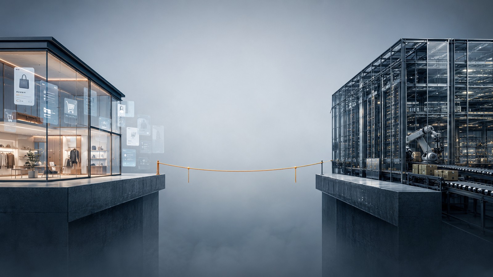
The Two-Project Problem
A retail founder once told me his app team and his ERP team hadn't spoken to each other in four months. Not because of a conflict. Because nobody's jo
Read More
Why Your Buying Process Is Killing Good Sales Deals
Last year, a VP of Engineering at a mid-sized UK retail firm found Brainium through a search. He read enough to be interested. He filled out the conta
Read More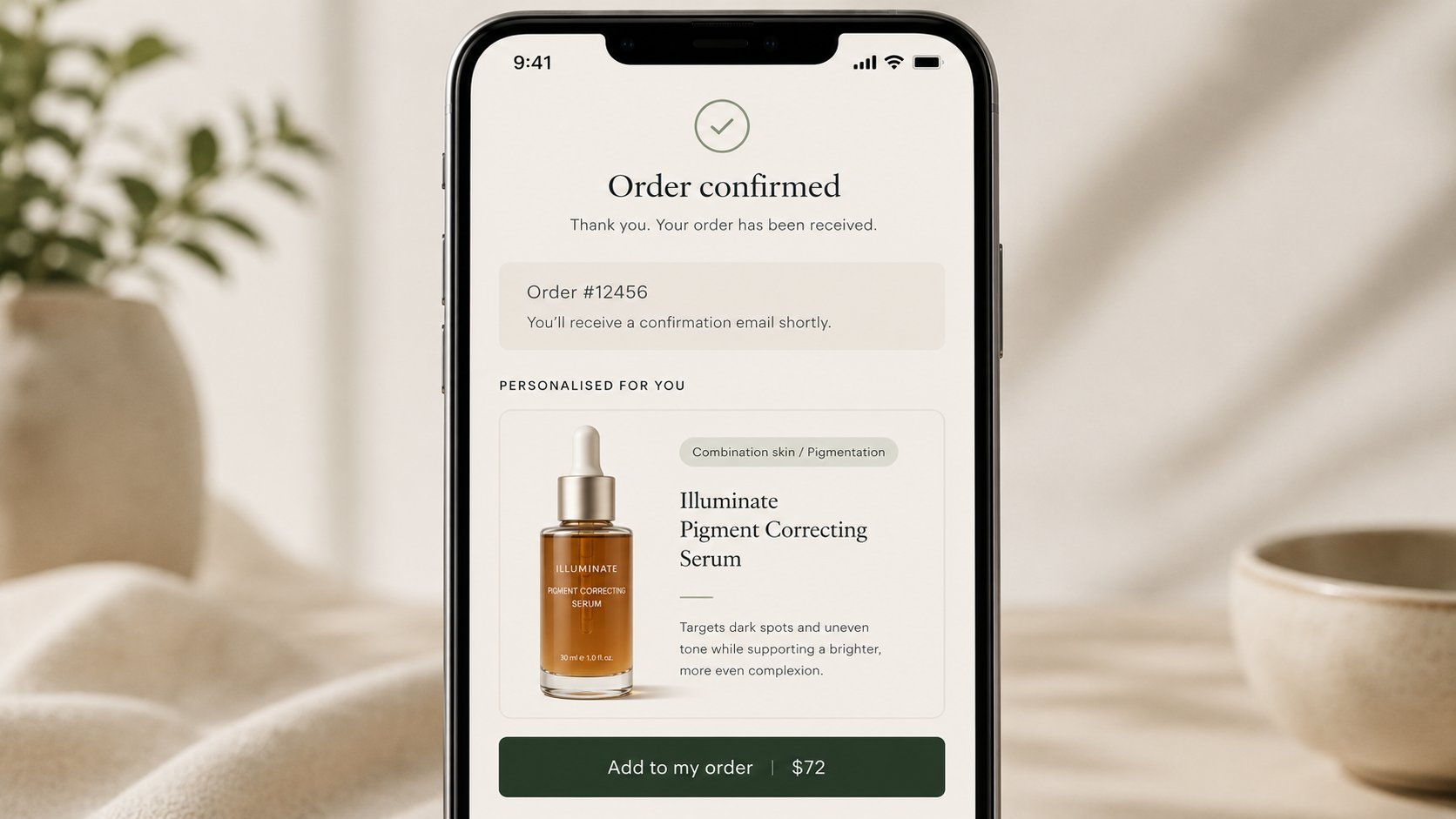
How to Turn Shopify Checkout Into a Personalized Upsell Engine
She had solved the matching problem. Six weeks after launching the quiz, the founder in Pune was looking at a return rate that had dropped from 14 pe
Read More
The Customer Who Knew More Than Your Algorithm Ever Could
She ran a clean beauty brand out of Pune. Three years in, and her ad creative had finally found its rhythm. Her CPCs were down, her conversion rate wa
Read More