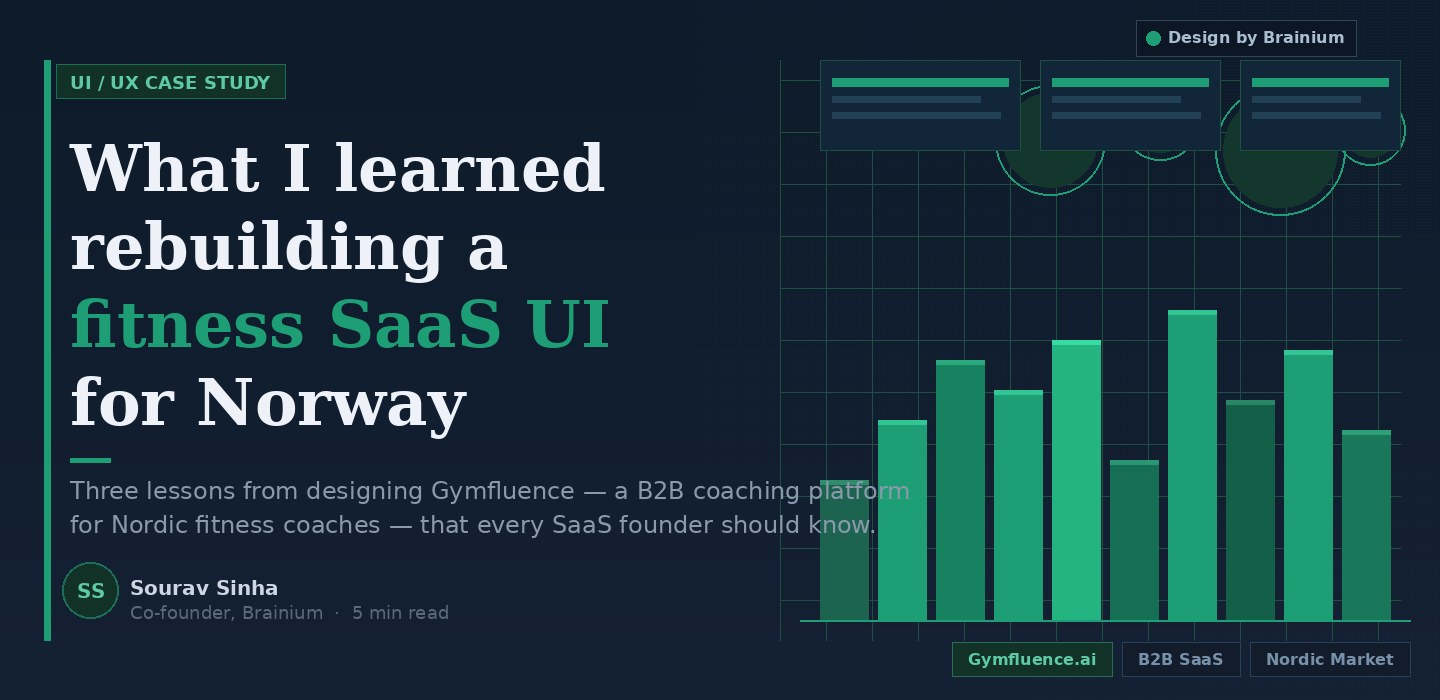
What I Learned from Rebuilding a Fitness SaaS UI for a Norway Client
A few months ago, Brainium completed a UI/UX design engagement for Gymfluence, a B2B SaaS coaching platform built for the Nordic market. Our mandate was design only: information architecture, visual system, component library, and screen-level UX for the coach dashboard and marketing site.
No development. No backend. Just design, done properly.
I want to share what that engagement taught me, because several of the lessons surprised even me and I have been doing this for over a decade.
The paying customer is rarely who you think it is
Gymfluence serves two users: the coach and the gym member. It is easy to assume the member experience should get most of the design attention, because members are the end users and the retention metric lives with them.
Wrong. The coach is the paying customer. The coach pays the subscription. The coach evaluates whether to renew or cancel. And the coach is spending the most time inside the product, monitoring adherence, tracking progress, managing a portfolio of clients simultaneously.
We reoriented the entire design priority stack around this insight. The coach dashboard became the primary design surface. The member interface followed.
This applies to almost every B2B SaaS product I have seen: the payer and the primary user are often different people, and design investment should follow the payer, not the most visible surface.
Geography shapes navigation expectations more than most founders realise
The Gymfluence client base is Nordic. That sounds like a minor detail until you are making decisions about information density, data privacy signalling, and how trust is communicated visually.
Nordic users have measurably different expectations around these things compared to what a South Asian or US-trained product team would default to. The dashboard density that reads as “powerful and comprehensive” to an Indian enterprise buyer reads as “overwhelming and untrustworthy” to a Scandinavian coach who values clarity and restraint above feature richness.
We calibrated. It required real user validation, not assumptions.
If you are building a product for a geography different from where your team is based, that localisation work has to be built into the design process, not treated as a post-launch polish task.
A component library is worth more than beautiful screens
The deliverable that matters is not the polished Figma presentation your team shows investors. It is the component library the development team can actually build from.
Screens are a snapshot. Components are infrastructure.
On Gymfluence, we delivered a structured component set covering data display cards, status indicators, progress visualisations, and navigation patterns, all with documented states. The development team received something they could extend as the product grew, not something they had to reverse-engineer.
Every design partner Brainium engages with gets this as a standard deliverable. I am consistently surprised how rarely other design vendors include it.
The full approach, written up properly
I wrote the complete methodology that came out of this engagement as a detailed guide on the Brainium blog. It covers seven specific approaches — from journey auditing to visual identity strategy to FAQ schema for AI search visibility.
If you are evaluating a redesign for your SaaS product or want to understand how to brief a design partner properly, that piece is worth reading: Best Approaches for UI/UX Redesign in B2B SaaS: What Actually Works
The Gymfluence engagement was a clean, well-scoped project that gave Brainium the conditions to do design work at its best: clear brief, responsive client, defined deliverables. The product is live. The coaches are using it. And we walked away with a sharper methodology for the next SaaS redesign we take on.
If you are building in the coaching, wellness, or professional services SaaS space and thinking about a redesign, I am happy to talk. Drop me a note through Brainium’s contact page or connect with me on LinkedIn.
Add SouravSinha.com as your Preferred Source on Google to stay updated with AI, software development, digital transformation, and technology insights.

Recent Comments
Related blog posts
The Sale That Happens After the Sale
He had the creative dialed in. Three years running a skincare brand out of Bengaluru, and he had finally cracked the short-form video formula that bi
Read More
The Night I Mapped Three Versions of My Life
I almost skipped it. It was late. Long day of calls. A few decisions I wasn't fully happy with. The usual pile of things that quietly move to tomorro
Read More
The Map Has Changed
There is a moment in every major technological shift when the rules don't just bend, they break entirely. We had one such moment in the mid-2010s when
Read More
The Product Page That Pays for Itself
She had built something worth buying. Eighteen months of sourcing. A manufacturer in Surat who finally got the drape right. An Instagram following th
Read More
Why Is Retention the New Acquisition for Growing Brands?
Most D2C founders treat the post-purchase experience like a courtesy. A thank you email. A shipping notification. Maybe a review request three weeks l
Read More
The point about the paying customer vs. the primary user is something I’ve seen trip up so many B2B product teams – including experienced ones. It’s almost counterintuitive because the member-facing UI is more “visible” and emotionally compelling to design for, but you’re absolutely right that the coach’s workflow is where the retention decision actually lives. Reorienting the design priority stack around that insight takes discipline.
The geography-shapes-navigation section hit especially close to home. The tension between “feature-rich = powerful” (which works in some markets) and “feature-rich = chaotic” (which kills trust in others) is real, and it’s rarely baked into the brief upfront. Most teams treat localisation as a translation task, not a perception and trust architecture task.
And the component library point – completely agree. A polished Figma deck that impresses in a presentation but doesn’t translate cleanly to dev handoff is a very common failure mode. The deliverable that survives contact with the engineering team is the one that actually matters.
Curious – did the Nordic clarity preference influence your typography and spacing decisions as much as it affected information density? That’s usually where I see the biggest visible delta between markets.
Really glad this one resonated, and you’ve picked up on exactly the tensions that made this engagement genuinely interesting to work through.
Your framing of localisation as “perception and trust architecture” is sharper than how I put it in the post, honestly. That’s the right way to think about it. It’s not about translating labels or adjusting date formats. It’s about what signals competence and reliability to a specific user in a specific cultural context. For the Nordic market, restraint is the trust signal. That’s a design decision, not a content decision.
On your question about typography and spacing, yes, significantly. We moved toward more generous white space, tighter type scales with fewer size jumps, and leaned into a more muted colour palette with higher contrast ratios rather than the vibrant accent colours that tend to work well in South Asian SaaS products. The visual “quietness” that would read as under-designed in one market reads as premium and considered in another. Same product logic, completely different aesthetic register.
What market were you seeing that delta in? Would be curious to compare notes, especially if you’ve worked across both sides of that perception gap.